Resonar, designed by Automattic's own Takashi Irie, made its debut in March. Created for food and design bloggers to showcase photography and longform posts, we've loved watching how you've turned Resonar on its head.
Here are five of our favorite takes, from simple and chic to full-color and bold.
Writer, filmmaker, and musician Joshua Porter transformed Resonar into a stark, high-impact portfolio site:

He opts for a static front page rather than a regular blog, populating it with a single row of monochrome that link to his books, music, and podcast. A simple menu helps visitors get in touch, hear more music, or dig into his blog posts. Open the widget panel -- on Resonar, you'll find it cleverly hidden behind the three dots to the right of the menu -- to reveal his social media connections, including Twitter and Instagram feeds.
Jessie Murray is chronicling a summer of travel on her blog, Japan, Etc., and chose Resonar to showcase her photos and reflections:
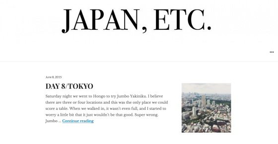
The widget area displays an Instagram feed, so followers can see where she's been between posts. Otherwise, there's nothing to distract from her words and photos -- just a custom header displaying her bold title, and a clean layout that puts her content at center stage.
Resonar also supports site logos. Grow RVA, an organization that supports farmers' markets and food sustainability efforts in Virginia, takes advantage of that to brand their blog:
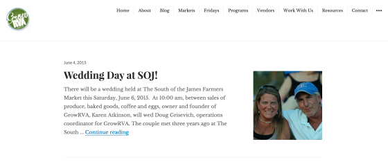
The menu helps visitors find information on Grow RVA's full website quickly and easily. Resonar lets them highlight additional photos of food and farmers, and the site logo keeps their branding consistent -- so you always know you're reading about Grow RVA, no matter where you are on their sites.
You don't need to be fluent in Spanish to appreciate the lovely site of photographer Garbi:
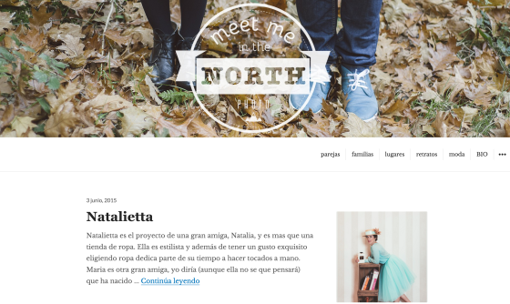
Wedding photos, street photography, fashion shoots, mom-to-be portraits -- Garbi does it all, and Resonar provides the perfect backdrop. She adds a playful header image, and a focused menu helps visitors navigate her posts. As with all Resonar-based sites, the classic serif typography is easy to read and lends an elegant air without distracting readers from the content itself.
Of course, there are still plenty of folks taking advantage of Resonar's glorious full-width images. A visit to the home page of food blog Elsa's Wholesome Life reveals this vibrant beauty:
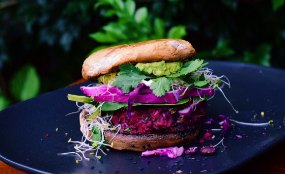
Beets, raw fudge, and eggplants have never looked so good!
Interested in giving Resonar a whirl? Learn more about it and explore the demo site in the theme showcase, or activate it on your blog from your Customizer.


Tidak ada komentar:
Posting Komentar