Whether you're a personal blogger, a designer, or an artist, Isola gives you a bright, clean space to showcase your work. Its minimalist design stays crisp across devices and screens of all sizes, with generous white space to keep the focus on your content.
Isola, a free theme, comes with numerous customization options, from featured images and custom header images to sleek post formats. Let's take a look at three sites that are already using it to great effect.

Leon Scott, who writes thoughtful posts on design and technology on his aptly-named blog, makes the most of Isola's out-of-the-box look. He kept the layout simple and clean; all the widgets are tucked into a panel off screen.
Many of Leon's posts -- like the one shown above -- include featured images, which establish their tone and also add a welcome burst of color.

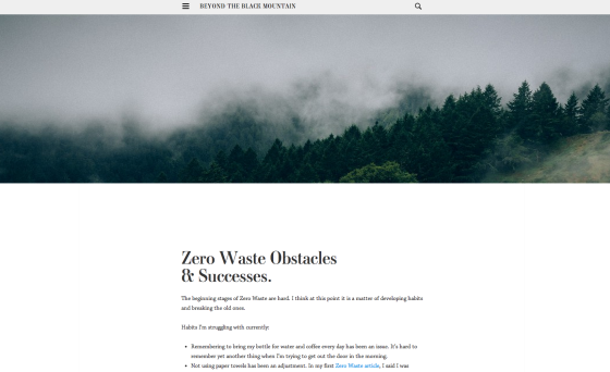
The environmentally-conscious blogger who writes at Beyond the Black Mountain focuses on the intersection between fashion and eco-friendly living. Her site's vibe echoes her approach elsewhere, with a stylish, spare look. A moody custom header image coupled with a retro serif font (Ambroise, which is available with the Custom Design upgrade) personalize Isola even further.

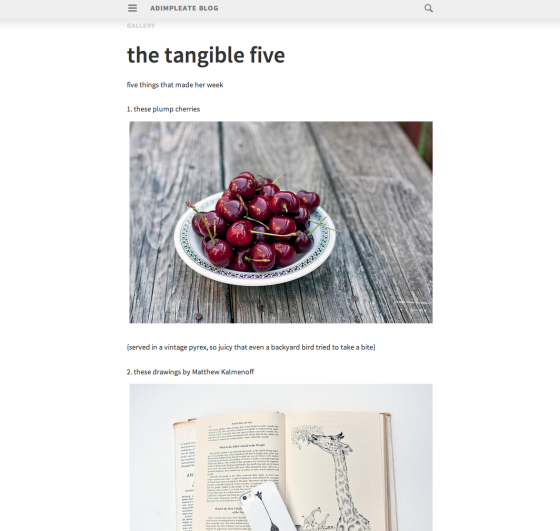
The blogger behind a dimpleate, based in Northern Virginia, has created a photo-heavy lifestyle blog that still maintains an airy, clean feel. She uses Isola's image and gallery post formats to highlight the beautiful images, linking them to her Flickr galleries for visitors who wish to explore more of her work.
Have you also customized Isola? Is there another theme you'd like to see featured here? Let us know in the comments.


Tidak ada komentar:
Posting Komentar